Python Tutorials part IV- Matplotlib Tutorial
1 minute read
By: Vishnu Prakash Singh
01 Oct,2019
from IPython.display import Image;from datetime import date
from IPython.core.interactiveshell import InteractiveShell
InteractiveShell.ast_node_interactivity = "all"
Data Visualisation using matplotlib
from matplotlib import pyplot as plt

ts = pd.Series(np.random.randn(1000),
           index=pd.date_range('1/1/2019', periods=1000))
ts = ts.cumsum()

ts.plot();
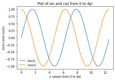
x = np.arange(0,4*np.pi,0.1)   # start,stop,step
y = np.sin(x)
z = np.cos(x)
fig = plt.figure()
plt.plot(x,y,x,z)
plt.xlabel('x values from 0 to 4pi');
plt.ylabel('sin(x) and cos(x)');
plt.title('Plot of sin and cos from 0 to 4pi');
plt.legend(['sin(x)', 'cos(x)']);
plt.show();
#saving the plot
fig.savefig('sine_cos_cuve.png')
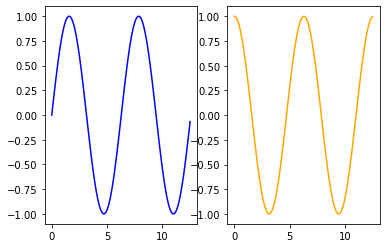
Subplots in matplotlib
plt.subplot(1,2,1);
plt.plot(x,y, 'blue');
plt.subplot(1,2,2);
plt.plot(x,z, 'orange');
Reading Titanic Dataset
Download From Here
path = 'C:/Users/392256/Documents/Intro to Python'   # change the path to your file location
titanic_data = pd.read_csv(f'{path}/titanic.csv')
titanic_data.head(3)
|
Survived |
Pclass |
Name |
Sex |
Age |
Siblings/Spouses Aboard |
Parents/Children Aboard |
Fare |
| 0 |
0 |
3 |
Mr. Owen Harris Braund |
male |
22.0 |
1 |
0 |
7.2500 |
| 1 |
1 |
1 |
Mrs. John Bradley (Florence Briggs Thayer) Cum... |
female |
38.0 |
1 |
0 |
71.2833 |
| 2 |
1 |
3 |
Miss. Laina Heikkinen |
female |
26.0 |
0 |
0 |
7.9250 |
Scatter Plot
# create a figure and axis
fig, ax = plt.subplots()

# scatter plot of Fare vs Age
ax.scatter(titanic_data[titanic_data.Fare<50].Age, titanic_data[titanic_data.Fare<50].Fare)
# set a title and labels
ax.set_title('Fare vs Age Scatter Plot');
ax.set_xlabel('Age');
ax.set_ylabel('Fare');

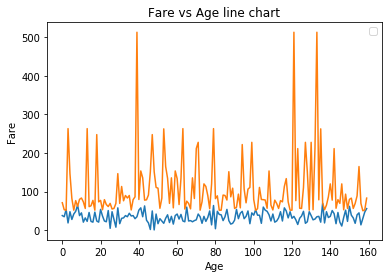
Line Chart
# get columns to plot
columns = ['Age', 'Fare']
# create x data
x_data = range(0, titanic_data[titanic_data.Fare>50].shape[0])
# create figure and axis
fig, ax = plt.subplots()
# plot each column
for column in columns:
    ax.plot(x_data, titanic_data[titanic_data.Fare>50][column]);
# set title and legend
ax.set_title('Fare vs Age line chart');
ax.set_xlabel('Age');
ax.set_ylabel('Fare');
ax.legend();

#plt.plot(range(0, titanic_data.shape[0]), max(titanic_data.Age)*titanic_data['Fare']/max(titanic_data.Fare),
 #      range(0, titanic_data.shape[0]),titanic_data.Age);
#ax.legend()
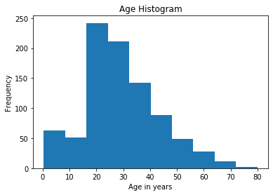
Histogram
# create figure and axis
fig, ax = plt.subplots()
# plot histogram
ax.hist(titanic_data['Age'])
# set title and labels
ax.set_title('Age Histogram');
ax.set_xlabel('Age in years');
ax.set_ylabel('Frequency');
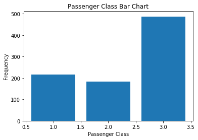
Bar Chart
# create a figure and axis
fig, ax = plt.subplots()
# count the occurrence of each class
data1 = titanic_data['Pclass'].value_counts()
# get x and y data1
points = data1.index
frequency = data1.values
# create bar chart
ax.bar(points, frequency)
# set title and labels
ax.set_title('Passenger Class Bar Chart');
ax.set_xlabel('Passenger Class');
ax.set_ylabel('Frequency');
Box Plot
Box Plot of Age Variable
fig, ax = plt.subplots();
ax.set_title('Multiple Samples with Different sizes');
ax.boxplot(titanic_data.Age);
ax.set_ylabel('Age in years');

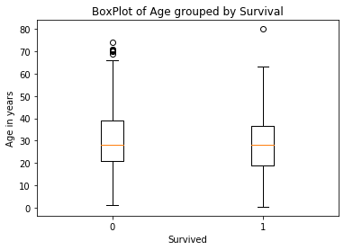
Box Plot of Age variable grouped by survive using matplotlib
data = [titanic_data.loc[titanic_data['Survived']==0, 'Age'],titanic_data.loc[titanic_data['Survived']==1, 'Age']]
fig, ax = plt.subplots();
ax.set_title('BoxPlot of Age grouped by Survival');
ax.boxplot(data);
ax.set_xlabel('Survived');
ax.set_ylabel('Age in years');
plt.xticks([1, 2], [0,1]);
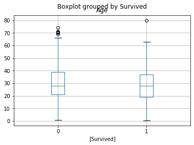
Box Plot of Age variable grouped by survive using Pandas
titanic_data[['Age','Survived']].boxplot(by='Survived');
THE END